
This report measures the number of patients "on treatment" over time. It helps you see the size of the patient market and what share of it you own in relation to competitors. It also lets you identify characteristics of your market, in order to confirm or correct assumptions about it you might have.
How can this report be used
The Patients on Treatment report could be used to:
- Create an overview of the general market for your brand
- Assess your brand strategy in light of real-world performance
- Confirm your understanding of performance as measured by other data sources (eg units sold)
How is this report calculated?
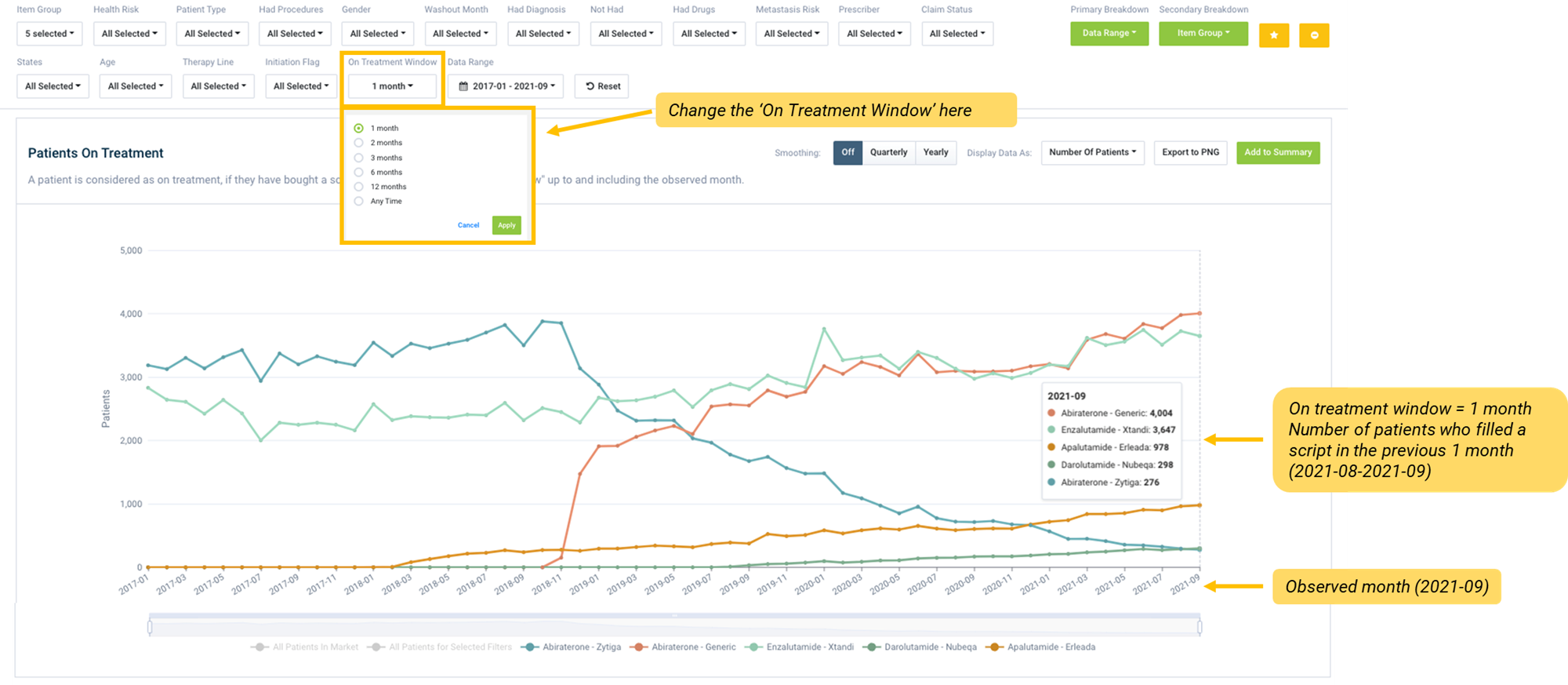
A patient is considered on treatment if they bought a script in the defined time range up to and including the observed month. The defined time range is called "on treatment window". The default “on treatment window” for this report has been set to one month.
You can change the “on treatment window” in the report filters above the chart.
What does this report show you?
You can identify how many patients on treatment for a condition (for a specified time period):
- are on your drug
- are on a competitor drug
- are on a particular class of drug
- are on a particular line of treatment
- are on a particular regimen
- are also being treated for a comorbid condition
- come from a particular demographic – sex, age, location
- have had a particular procedure
- have particular diagnoses
How can you modify the chart?
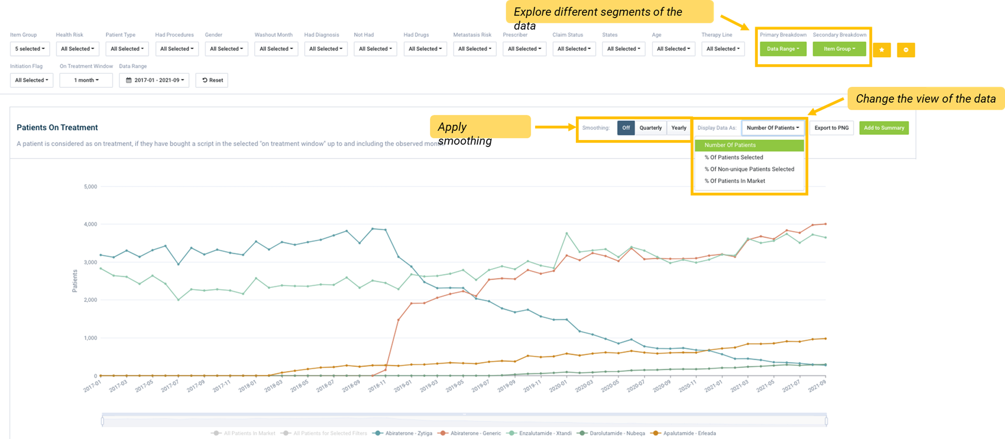
Breakdown
Use the Breakdown buttons to explore different segments of the data by other variables. You can modify the chart by selecting the base data (Primary breakdown, or x-axis) and the variables you want to view the data by, like age, sex or location (the Secondary breakdown).
Display options
You can configure the view of your data by changing the chart type, display data and data metrics or, applying smoothing.
- You can select the preferred chart type, either stacked bar or line chart. Depending on the data you are exploring and the question to be answered, changing the chart type may assist in visualising comparisons.
- Display allows you to view Actual data or Modeled data in the chart and table.
- Applying smoothing to the data will smooth out the trend over time (moving quarterly or yearly average).
- You can select the metric you want to view your data, by selecting an option from the Display data as dropdown.